Sunday, September 7, 2008

Certificate

Those are the things I did for event club last week.As you know we all have so much assignment to complete so I did not take so much time at all. Only 3 hours to finish all of them.


Photobucket


Photobucket

This is the thing I will get( I hope so)

Photobucket

Photobucket


In my opinion I can do better if I have had more time,but I still very am proud of them cause one thing.There is a hidden massage in the three gold,bronze and silver.And the person that I want to let her figure it out, did find out the massage.If you guys can see the massage then contact me.

Saturday, August 30, 2008

Masquerade

Well, finally the so-called party of year comes. I did not play an important role on holding it but one of my friends did,and it's Khanh. Anyway I will go there tomorrow and take some photos about it (I'm not so sure what r they gonna do with my photos but that's my promise).Moreover I did one thing for the party so far and I will show you right now.
Photobucket

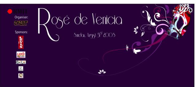
This is the stage background. I think it will be better if those logos especially the "Event club"'s logo are not that big. But it's a requirement and I can do nothing about it. Thanks to Nguyen Ngoc Nu for helping me finish it.


Photobucket

Photobucket

Photobucket

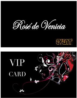
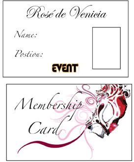
These are Member card,VIP ticket and VIP card.Well I dont know how do they look in real life just hope it's not so bad.
As you see they all have the same lay-out.Although I changed a little bit in the detail to make them less boring. I think if I can do it again it will be much better than this but honestly I didn't have enough time to come up with a great design if they only contact me in the middle of the night and want to get it done by the next morning like this. But one thing make me happy is I love pink and it's the first time I used pink in my work so far(Assignments and exercises don't count).

Thursday, August 14, 2008

Rosa de Venicia

Well I've got a new job. The event club hold a new party.The name is the title of this entry. I will be the say official photographer of this event,in other word I have a free ticket and all I have to do is bring along my camera.
These picture was taken in Wednesday in a promotion campaign of this party.Some guy wore tuxedo and hand girls in school the leaflet and roses.
So well I want to help my friend a little bit,by posting this entry.That may say remind you guys about the party(Ask Khanh for more infor)
About the banner it's not the thing for ads like usual.Cause we don't want the web to be boring so we add in some flash element which is the thing that contain the world map and some moving images.Actually every spot in the map are the link to some other website but they haven't built them yet so it's not working now.
Photobucket

Photobucket

Photobucket

Ooo,I love this smile

Photobucket

Friday, August 8, 2008

Collage

Since we have the assignment on this subject.I think this is kind of a good example for what we are doing.This is the video clip from Franz Ferdinand , I don't like the music (I'm kind of a jazz fan) but the video s really cool.You can see the clip look like some thing that was cut out from the news paper.It's really old dadaist and a little in my opinion.I think it don't have this clip have a big concept at all, it just looks good the kind of the whole point of Dada that try to make something new something chaos and more over it doesn't need to have any meaning at all.

Take Me Out - Franz Ferdinand

Tuesday, August 5, 2008

Another website of mine

This is the website for I-Pop company,a huge organization.They are the one who stand behind the show "American idol".
This time I didn't do the whole thing but just the flash part which is the banner. Here the link.

http://www.i-pop.vn/ruby2/home.html

Tuesday, July 29, 2008

Have u ever seen the city like this??

What A Wonderful World - Louis Armstrong


Photobucket

Photobucket

Photobucket

Photobucket

Photobucket

Photobucket

Photobucket

Photobucket

Photobucket

Photobucket

Photobucket


I love this city.I was born here and sometimes I think that i will die here.
I'm kind of the guy who is interesting in going around the city. Usually with my friends, we kind of explore the city in our own way. This is the result of those trips we made.Sometime we lost and found something that unbelievable that it's in this city.Sometime we wake up at 4:00 am or stay awake for the whole night for shooting photo(sound crazy huh?).
But I foung the beauty in every corner of Saigon and you can love it like me if you start to see everything carefully.
One last things the song is not mine,but I like you to turn it on when seeing my photos.It's a really nice song anyway

Saturday, July 26, 2008

Mùi and Phá

La Vie En Rose - Edith Piaf


Some really famous photos(you guys must see this before) from another photographer Justin Maxon. It 's is a really an impressive collection,firstly for the beauty of each shot and then from the story of them. I still wonder about two things.How can this woman and his son still live happily,I mean they must the most optimistic people in the world.Why was this story discovered by a foreigner.There're a lot of good photographer in HaNoi but do they let their eyes wide open to see every details of life around them.Don't get me wrong but what I mean here only just when you are too familiar with something you then can actually see the small changes in it.

Photobucket

Photobucket

Photobucket

Photobucket

Photobucket

Photobucket

Photobucket

Photobucket

For more about this story here the link for you
http://www.relativeexposure.net/content/view/32/79/lang,vi/

Friday, July 25, 2008

10 Tips to better print design

1.Remember to bleed

The bleed is the part on the side of your document that gives your printer that small amount of space to move around paper and design inconsistencies. No matter what guidelines they have on their site, the printer will use anything you throw at them. A 3mm bleed on all sides is a safe standard for your work.

The settings in InDesign are right there in the new file dialog… but hidden! You need to hit the 'more options' button before they become visible. If your already in a document you can find them in the file > document setup dialog.


2.Overprint is fun
Is your budget limiting you to only 2 Pantone(PMS) colors? No problem. Try to experiment with overprint options to get a look with more depth with a limited color palette.

You can even work with photographs with only 2 Pantone's, just do them in duotone or monotone.

3.Think outside the paper
The human mind fills in gaps and will see the bigger picture if you aim for it. Using the border of your paper can be great fun and another tool to work with.


Obviously, this is not the final solution to all your design problems. It should help you to see that your work doesn't end at the edge of the paper.

4.Paper size standards are great, but don't let them hold you back

Square booklets, for instance, make for a more interesting reading experience, while smaller sizes (A5 for example) are much easier to take with you. Fly away from that standard A4 and take some risks.

5.People read

In conflict with some designers of the last 5 years I still think form follows function. This means in print design: If your working on something that contains textual content concentrate on the content.

You should use typography as a element in your design, however you should always aim for optimal readability.

6.Amount of content

If you have some kind of idea that there's too much on your page; there is indeed to much on your page. Define what's really necessary and remove any visual noise. It's corny but it's true: less is more. If the client makes you cram too much content on one page, tell them.

7.Stick to the grid

Working with grids is the key to any good design. Using it's proportional relations, composition guidelines for the base of your design is a good idea.

Don't always go for the standard 3-column setup. A 7 column setup offers a lot of playful combinations… 2 column overlaps, a 3/3/1 setup with a sidebar and so on…

8.Typography is king

If the typographical setup is bad, no amount of lines or other elements will fix it. The fonts you use the most in your project set the voice for it's overall feel: don't pick the first font you like; think about what voice it should have and the best way to communicate this to your target audience. You can have a lot of fun with the basic well designed fonts: Helvetica, Swiss or Akzidenz Grotesk will save you from the worst typographic horror-scenario's.

It takes a while to get to know a font. A good way to get good with a particular font is to pick a list of 5 to 8 fonts you think could work for you and concentrate on those. That's also a good way to find out which fonts mix and which won't.

9.Invert

Need to give a bigger impact to a quote or logo? Invert it. White on black (or on any dark color for that matter) will always give your design or typography more strength.


Be careful with smaller type sizes (8pt. and lower) as these will be possible problems for your printer as ink always flows around a little when just printed. This effect is called trapping. Of course this all depends on what kind of paper it's printed on, printing speed and other factors. Ask your printer about exceptions.

10.Be demanding about photographic content

You should always demand high quality source material to work with. When working with photographic content for example the "trash in, trash out" rule applies. A good photo can take your work to another level, a badly lit low resolution photo will ruin your work. Most clients will send you what they have for grabs… bug them a bit and they'll magically come up with better materials.


P/s: This is something I found online.I think it really good for designer with their own printing work.

Tuesday, July 22, 2008

Kids

Just some other pictures. In this time I try to focus on people more than any time.
The best thing when shooting little kids is they always act naturally in front of the camera .That's a good point cause when shooting all of the girls(I already upload here) I had to try so hard to get the most natural shot I could.
The kids here include my niece and nephew and some other ones which I met in the streets. Some of them got a really good life,some have a real tough life.The different is too obviously


Photobucket


Photobucket


Photobucket


Photobucket


Photobucket


Photobucket


Photobucket


Photobucket


Photobucket

Saturday, July 19, 2008

Vietnamese street typo

This is what I've got after going around the city. Graffity is still something new in here,so most of them look really bad.Beside there're somemore things which are familiar with everyone live in Sai Gon

Photobucket


Photobucket


Photobucket

Photobucket

Photobucket

Photobucket

Photobucket

Photobucket

Photobucket

Photobucket